Understanding color theory will make your design and decoration projects much easier.
1. How to use the color palette
Like trigonometry, the color palette is probably one of those things you learned as a child and never used again. Still, to really understand color, you must dust off a little of that knowledge.
The color palette gives us a visual representation of which colors blend well with each other. This basically takes all the guesswork out of us. All models consist of this, but in theory the color palette can be expanded to include an infinite number of shadows.
Don’t worry if you haven’t memorized the color palette until now. There are many ways to access it digitally. Paletton is a web page that will help you create your own color scheme from the comfort of your computer screen and ColorSchemer offers the same capabilities in an application that is available for iPhone.
The color palette is paramount when understanding color theory.

2. What are the basic colors
We can bet that some of you read the last paragraph and it was like, “12? How are there 12 colors in the color palette? There are only 7 colors in the rainbow. ” True. But trust us, there are, in fact, at least 12 shades in each color palette. This is how things go:
– Primary colors: Red, blue, and yellow. They cannot be made from the combination of other colors.
– Secondary colors: Orange, purple and green. They can be done by mixing the primary colors.
– Tertiary colors: The six shades that can be formed by mixing the primary and secondary colors. If you are unsure where to start when it comes to decorating a colorful interior, one of these 12 is commonly a good starting point. Choose one and this will help guide your choice until you find the exact shade you wanted.
Primary and secondary colors brighten any space immediately.
3. Changing colors with neutrals:
When you have selected a basic color, it is easy to create many different versions from the same family. All you need to do is combine the color with a neutral one so that it becomes lighter or darker. In interior design language, this is known as pastel, hue, and hue.
– Pastel: the action of lightening by adding white.
– Hue: the action of darkening a color by adding black.
– Hue: gradually darken a color by adding gray.
Many artists recommend experimenting with colors by mixing paints until you feel how dramatically neutral colors can affect a color. Still, if you need to access art tools, you can easily see a pastel and tint example by going to your favorite home store and picking up some of those sample color palettes.
Create pastels and hues by adding neutral colors to the base color.
4. Understand the color temperature
Perhaps you have heard of colors described as having a temperature. A dining room should be painted in warm tones while your friends can choose a fresh color to finish their room. These temperatures also describe where in the color palette this is.
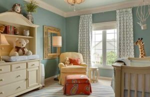
Reds, oranges, and yellows are normally described as warm colors. Typically they are more vibrant and seem to bring a feeling of liveliness and intimacy to the space. In contrast, blues, purples, and most greens are the cool colors. They can be used to calm a place and bring a feeling of relaxation.
When choosing the color temperature for a space, you must also take into account the size. Using a warm color in a small place could make you look a little claustrophobic. Still, using fresh colors in a spacious place could make it feel empty.
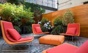
Use warm colors to stimulate a lively conversation.
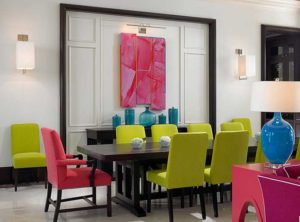
5. Complementary color scheme
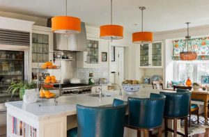
When it comes to color schemes, the companion is the simplest. Use two colors that are opposite in the color palette. Normally one color acts as the dominant hue and the other as the accent. This means combinations like red and green, blue and orange, or yellow and purple.
This color scheme is extremely high contrast, meaning it is best used in small quantities and when you want to draw attention to a particular design element. You could use it to make your dresser flashy or attract an extra vibe to your home office.
Use neutral colors to balance the high contrast of a complementary scheme.
6. Separate the complementary color scheme
If you like the idea of the complementary color scheme, but you’re scared that it can be very strong for your taste, separating accessories is a safer choice. To make this color scheme, you must first choose your base shade. Then, instead of choosing the color directly opposite the base, choose the two shades on either side of the opposite color.
These two nuances will give much more sense of balance to the place. You still have the visual impact of a strong color, but you will have the ability to incorporate more instead of leaning more on neutral colors to make the space look cooler.
Separating the complements is best when you use your base color as the dominant. Still, instead of choosing a saturated hue, try to focus on a color that is more subdued. Then make it stronger with your other two nuances in the accented pieces of the place.
Separate complementary color schemes are almost always a fresher version of their complement pairs.
7. Analogous color scheme
Analogous color scheme refers to using three colors followed by the color palette. Typically two colors can be primary colors and the third a hue that is a mixture of the two and a secondary color. For example, you could choose red, orange, and yellow or red, purple, and blue.
The key to using this color scheme successfully is proportion . Again, the 60-30-10 rule comes into play. You will have to choose a color as the dominant shade, and the third, the most vibrant color as an accent.
Interestingly, you can also create a similar color scheme using neutral colors. This is normally called a monochrome color scheme. Just choose black, white and gray instead of lighter shades.
Stay in one section of the color palette to create a relaxed feeling.
8. Three color scheme
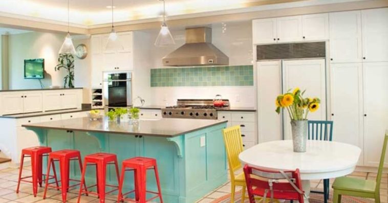
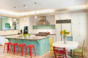
Three color schemes, sometimes called triads, refer to using three colors with equal spacing between them on the color palette. The three primary colors (red, blue, and yellow) are a perfect example, as are the three secondary colors.
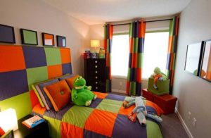
This type of color arrangement is usually too strong. Since the colors have so much contrast and such pure shades are used a lot, you will see this scheme more in children’s bedrooms or playrooms.
When using vivid colors, it is very important to consider the spaces that are nearby. It would not be good to put two color schemes of three next to each other. This would be too much. Instead, make sure the rooms next to your triad space are calmer and mostly neutral.
The intensity of a three color scheme makes the perfect choice for a child’s bedroom.
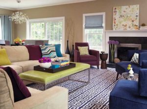
9. Four color scheme
After the three scheme, things get a little more complicated. Now we are going to balance four colors in one space. The four scheme, often also called the rectangle scheme because of the shape it makes on the color palette, focuses on using two different pairs of complementary colors.
In this scheme, color temperature plays an important role. Try to make sure you choose two warm colors and two cool colors to fill the space, rather than an odd number. Using an even amount of each will help bring balance to the space.
It is also important to vary how we see the colors. Look for embellishments that match the color scheme, and don’t try to mix them up in your solid spaces. If you only use solids, the place will look oversaturated, but many decorations can match, so focus on picking one or two to help make the place look more spacious.
Balancing warm and cool colors is essential in a rectangular color scheme.
10. Square color scheme
The square color scheme is very similar to the rectangular in number and name. It also uses four shades, but instead of focusing on opposite pairs, colors have even spaces in the color palette.
Regardless of which colors you choose, this scheme will consist of one primary color, one secondary, and two tertiary. Vary the intensity of the four colors by making two shades more neutral and two stronger. Again, similar to the four scheme, you would like to pay attention to achieving an equal number of warm colors and fresh colors. But, instead of giving equal attention to the two color pairs, you should select a hue to dominate the space and use the other three as accents.
Mix prints and solids to add an interesting visual impact.
Sometimes the language of interior design can be tricky. No one can blame you if talking about furniture, schemes and decoration drives you crazy. There are many terms! In an effort to make the design accessible to everyone, we have reviewed some basic things about color theory. Use this guide before starting your new project and you can do it like a professional.